After many years of the same branding, a change in management prompted a rebrand of Coopers. As a former employee I was really excited to be leading the project.
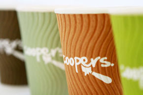
The old Coopers branding felt outdated. It no longer represented the identity that we felt the company had. The challenge was to capture who Coopers were and what their offering was.

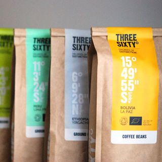
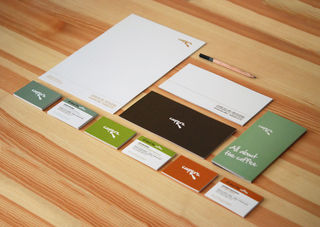
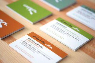
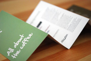
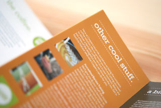
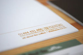
We concluded that at it's core Coopers identity lied with it's staff and their relationships with customers. As a team they are friendly, approachable, reliable and fun. We tried to capture this in our use of typography, tone of voice and colour palette.
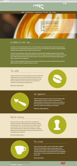
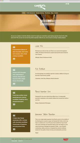
The next phase of the Coopers rebrand was redeveloping their website. I developed a content strategy with the goal of the website to be a useful information resource that encourages potential customers to make contact. The website was designed to work responsively so that it could be accessed from the many devices.
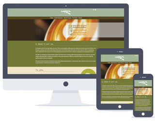
Since launch the website has been well received. It has seen an increase in traffic and a decrease in bounce rates (particuarly on mobile devices). Prior to the re-launch the site had very little mobile traffic, now it is over 50% mobile. The site was also featured on a number of web design inspiration websites.