I had to write about this because I found it so interesting, I read about it the other morning when I was on my way to work. It turns out that Peter Saville has designed the new England shirts.
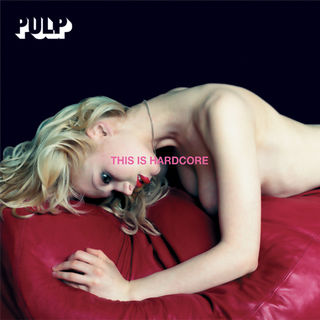
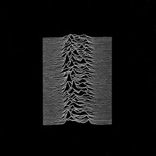
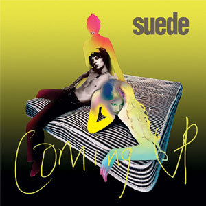
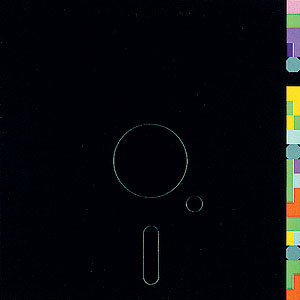
For those of you who don't know who Saville is he is one of the most influential graphic designers around. He is probably most well know for his work within the music industry, mainly Factory Records. He has designed covers for the likes of New Order, Pulp and Joy Division. Here are a few examples of his work.
Umbro asked Saville to come up with some design ideas for the shirt, the brief was that the shirt had to be white and they wanted him to add a splash of colour to it. I have read that he came up with a 50 page PDF to present to Umbro. This is the design that was chosen.
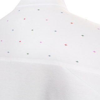
Personally I love it, I think it is very discreet and minimalist. Saville attempts to represent modern England using a pattern of multicoloured crosses of St George on the shirt. This is very much a love it or hate it affair, there has been many complaints that the design is pointless. Umbro will be releasing a limited edition version of the shirt where the pattern is all over and not just on the shoulders (despite not being a major football fan I am tempted to buy this just because of the design!).
I am intrigued to hear what people think of the design, please post any comments you have and let me know if you love it or hate it!
