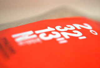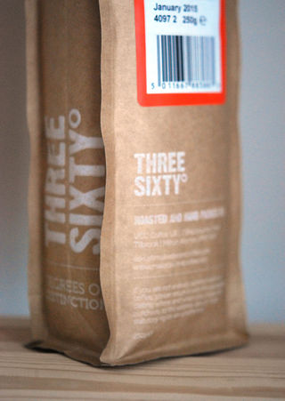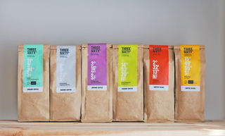
Three Sixty is a bold and adventurous range of premium coffees, all hand crafted and hand packed. Each coffee has it’s own set of co-ordinates which can be used to find the origin of the coffee on a map.
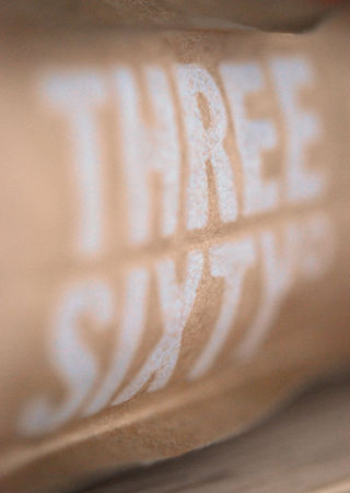
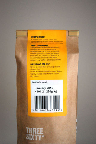
The Three Sixty range was due to be launched in Waitrose. My role was to design the retail packaging to fit the existing brand and concept.
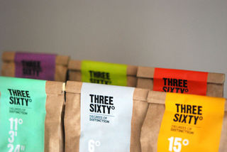
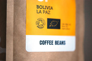
I wanted to make a focal point of the co-ordinates of the label. I hoped that they would intrigue people into understanding their purpose and meaning, which would encourage them to explore the packaging further.