Kiln are a small independent company who produce beautiful everyday ceramics for the home, straight from the kiln.
Targeting a more creative audience who have a love for hand-crafted goods, Kiln appeal to the consumer who likes to take their time over a Sunday morning coffee and enjoy the simple things in life.
My aim was to create a modern yet elegant identity that will complement the sophisticated pieces that have been carefully crafted in the kiln.
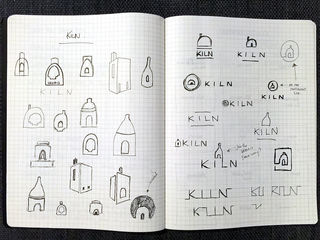
The identity will need to capture the very essence of the kiln and represent this with a bold icon that would be just as recognisable on its own as it is with the word “Kiln”. So of course the first thing I did was get my sketchbook out and started to research kilns and their various shapes.
Using a subtle but adventurous colour palette the brand will combine colourful elements with natural textures and materials. This will give a distinct personality and feel to Kiln that represents the true craftsmanship and style of the brand.
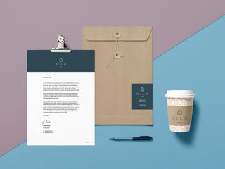
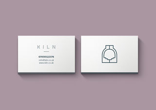
Kiln stationary makes use of the deep, bold blue combined with the elegant logo in a minimalist way. The icon can be used without the "Kiln" text to make more of a statement, as seen in the below business card design.
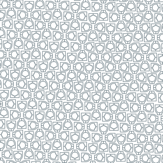
I also thought the Kiln icon worked so well on its own that I thought creating a pattern out of it that could then be applied to packaging elements would be a nice finishing touch and great brand asset. This can be applied to items like tissue paper that the products would then be wrapped in before being placed inside the box, or applied on the packaging itself.